Einstein Bros. Bagels
01.SCOPE
BRAND IDENTITY
CUSTOM TYPOGRAPHY
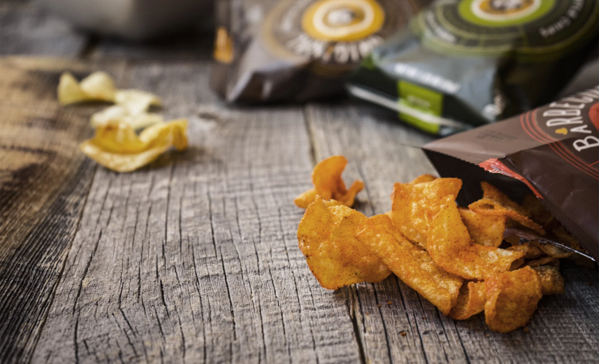
PACKAGING
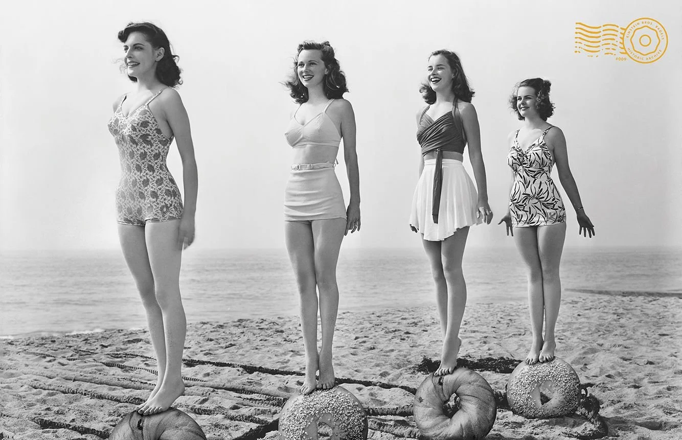
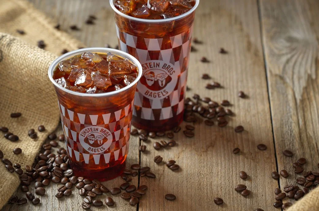
PHOTOGRAPHY
COLLATERAL
MENU SYSTEM
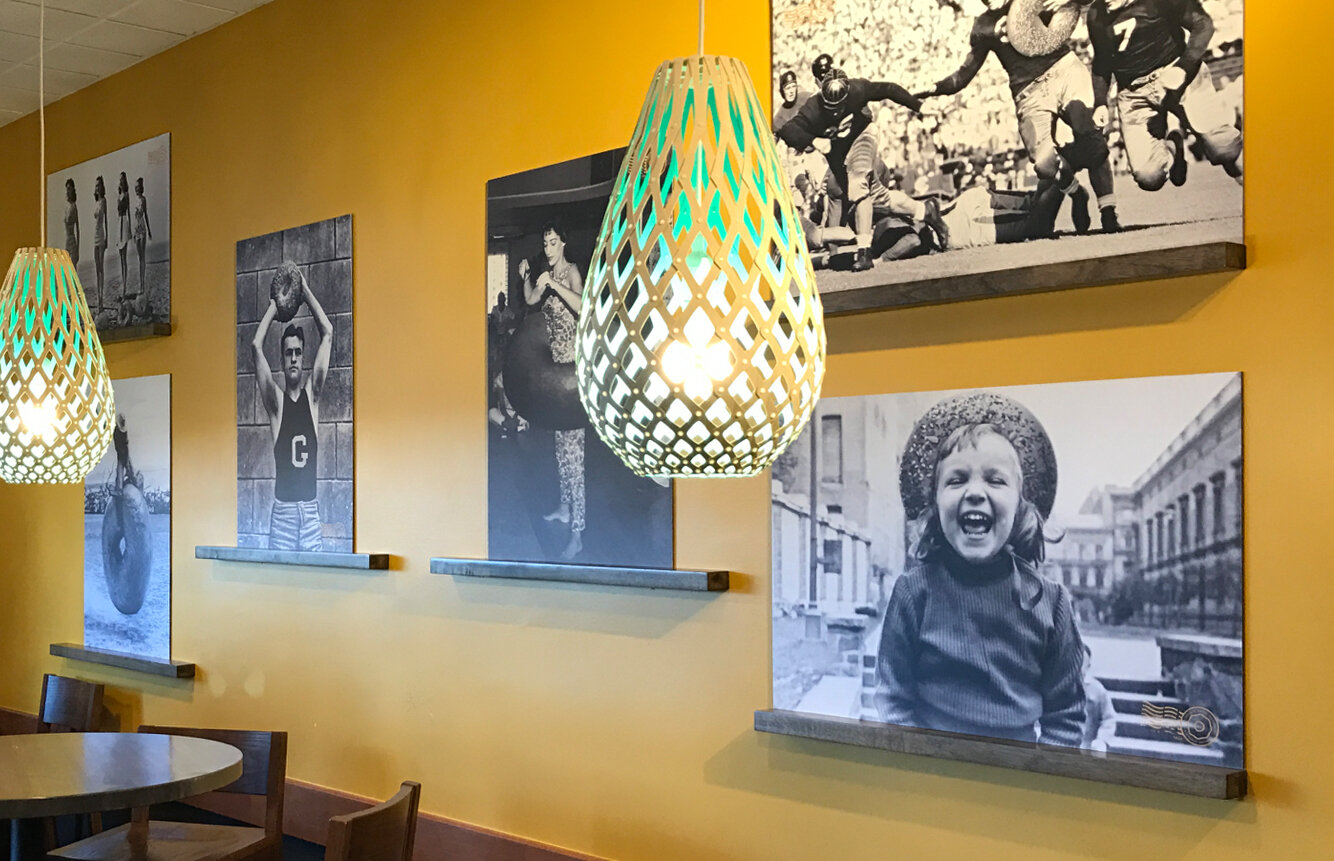
ENVIRONMENTAL
MERCH
WEBSITE
02.STORY
After 20 years of growth Einstein Bros. Bagels reached a point where a rebrand/refresh was in order. They were given a completely reimagined style. For Einstein's, brown is the new black. It’s the color of baking. It’s the color of bagels. And it’s a perfect complement to the iconic gold of the brand. The logo was updated along with the brand color palette to reflect just that. The photography style shifted to focus less on cut-out imagery and more on mouth-watering, in-your-face real food. And finally, to carry the unique brand voice, 4 custom typefaces were created to become the visual communicators for the brand. Named after the “Bros.” themselves, these fonts display the voice of Einstein Bros. Bagels.


03.DETAILS
After nearly a decade of the same packaging it was time for a comprehensive refresh built on a foundation of memorable and contemporary patterns based on the product. The new packaging affected over 60 elements, each working as its own mini billboard to reflect a core equity of the Einstein Bros. brand.


04.DETAILS
Einstein Bros. Bagels operates over 900 locations. But each store contained different elements from past store designs, some of the containing artwork that was over two decades old. We created a system wide graphics and interior materials package to launch along with the updated brand look and feel. We created a flexible system that offered the ability for stores to mix and match various creative elements over hundreds of unique restaurant configurations from free standing stores to smaller airport posts.