
Quicksilver Scientific
01.SCOPE
STRATEGY
BRAND IDENTITY
PACKAGING
VOICE & TONE
COLLATERAL
MERCHANDISE
WEBSITE
02.STORY
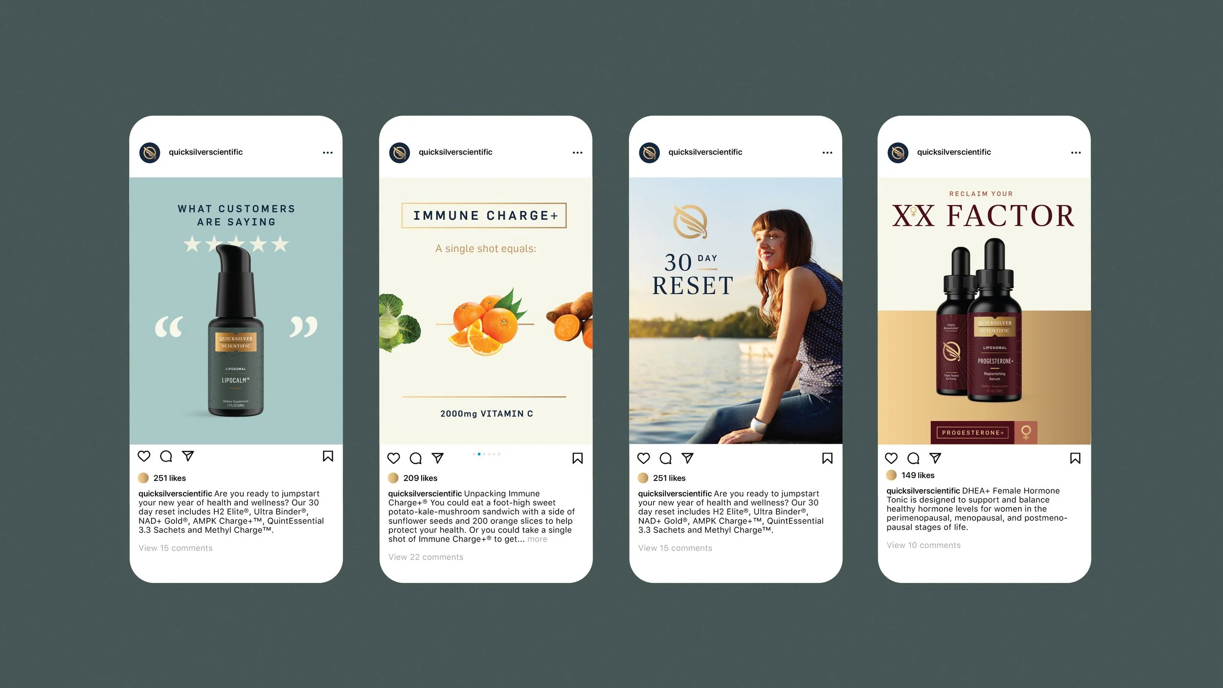
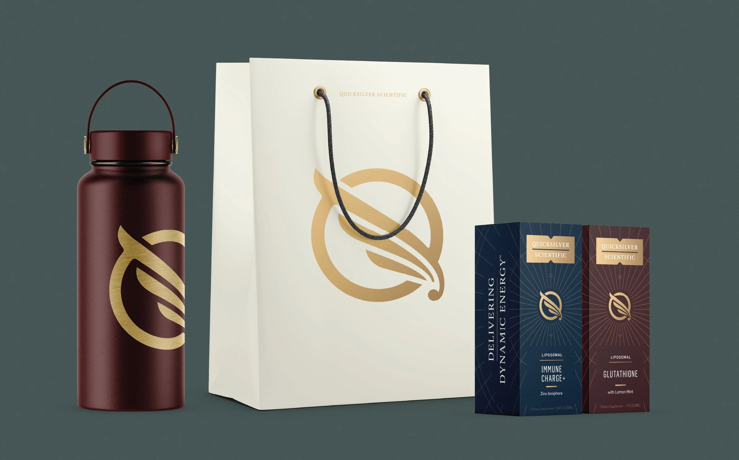
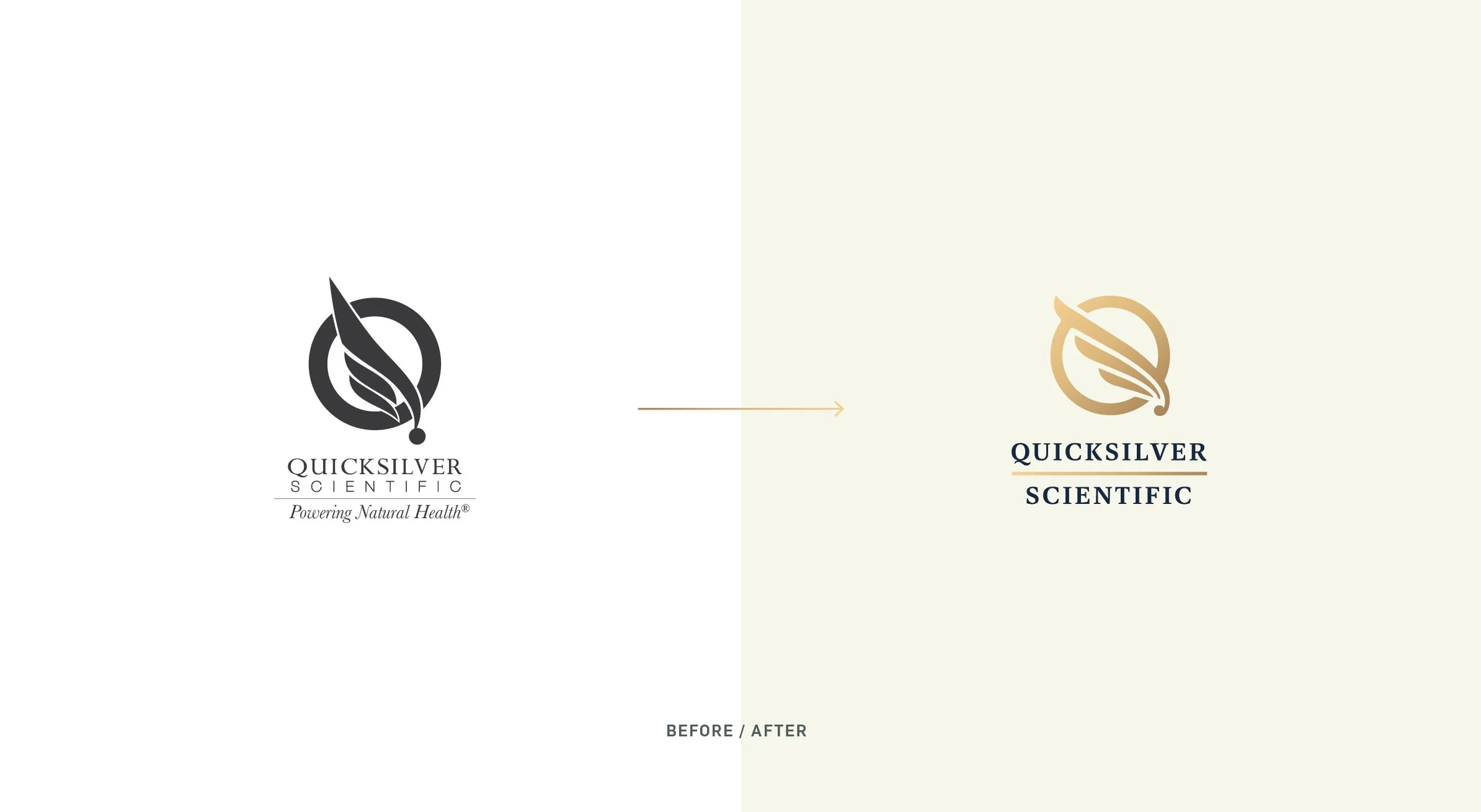
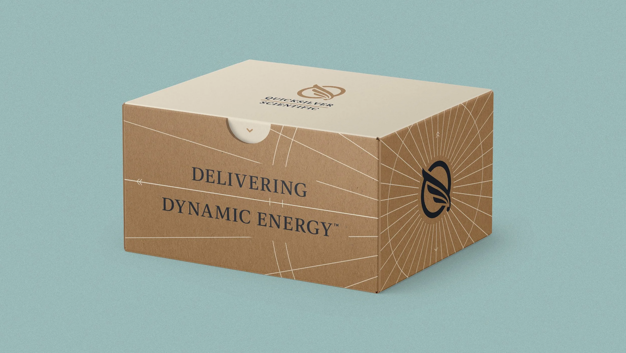
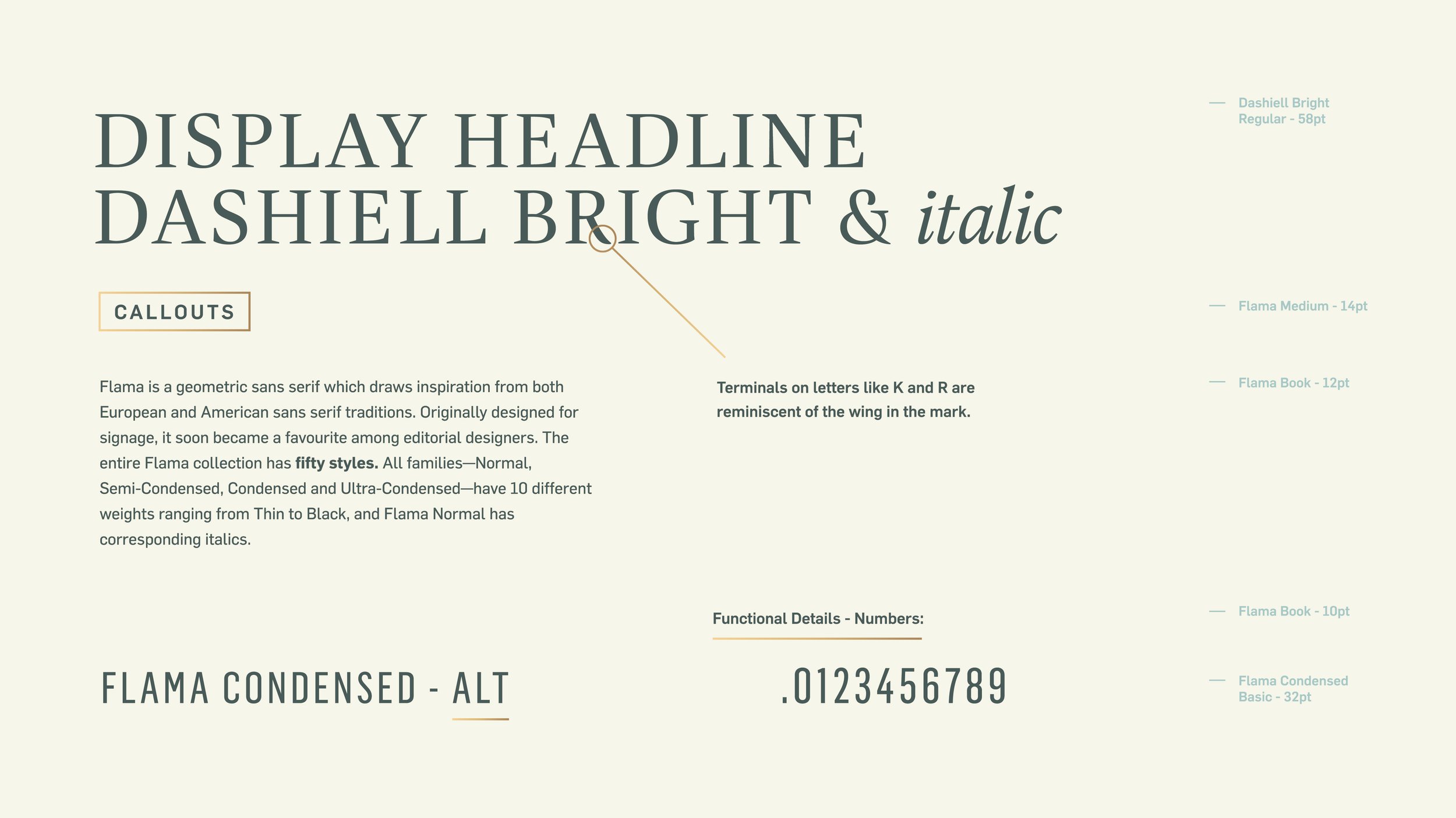
Quicksilver Scientific came to us with an interesting challenge. To take what was an established entity, well respected in clinical circles as a B2B brand and turn up the dial on premium. Way up. So we did exactly that. We created a new visual identity that leveraged their existing equities and crafted everything from their voice and tone to their brand architecture strategy. We needed to make sure that this new system could work for a brand that is constantly innovating and bringing new products to market. Quicksilver creates dynamic energy for dynamic lives. Those who are never satisfied with the status quo and those with energy, performance and potential they haven’t tapped into yet. That’s where Quicksilver delivers. Highly bioavailable and constantly elevating industry standards. This is a brand that is working with the nuanced differences the human eye can’t see, but the body can feel.





03.DETAILS
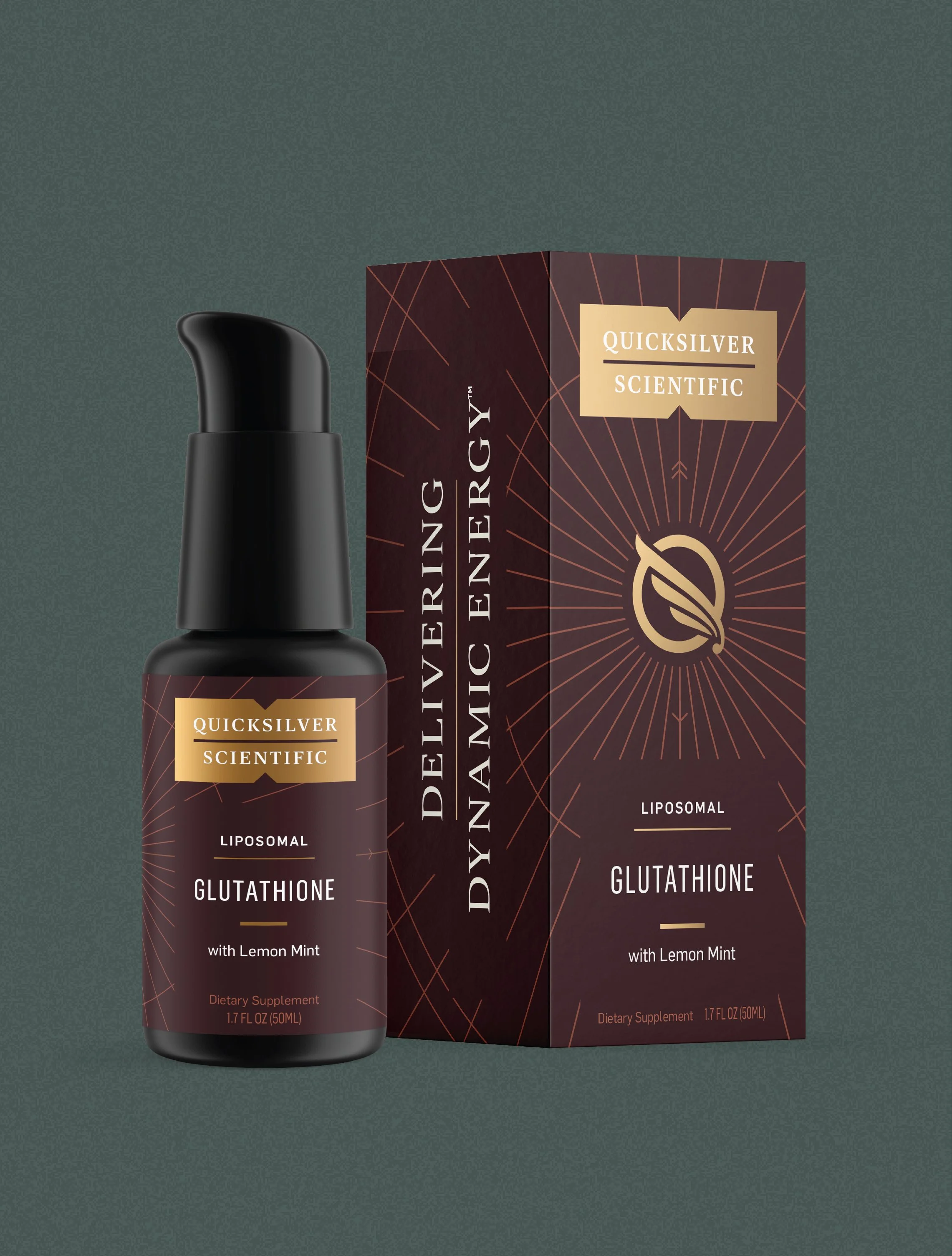
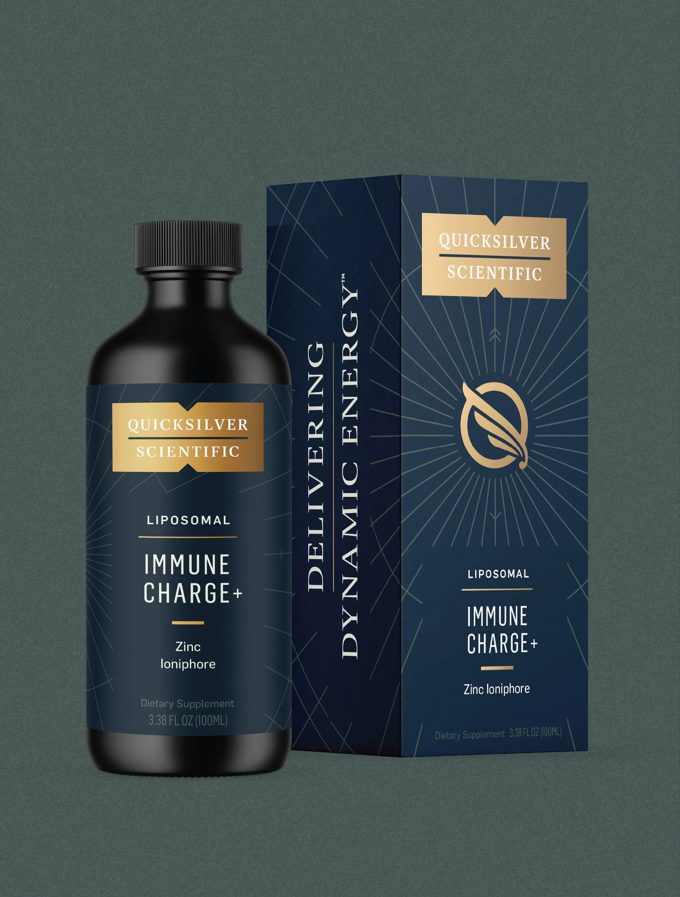
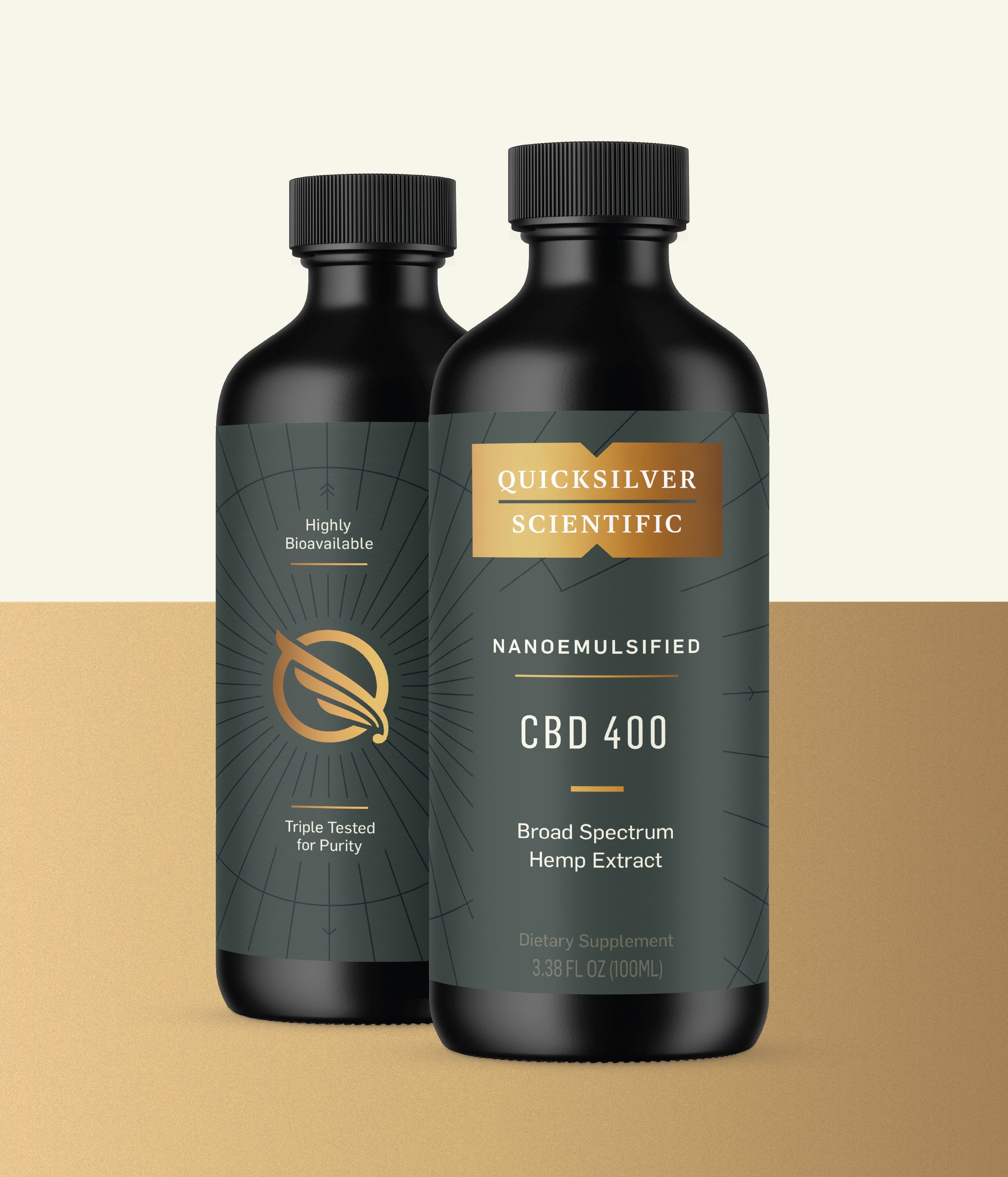
With over 90 SKUs and 16+ package vessels we needed to craft a brand architecture that can help practitioners and ultimately patients discern the differences between products from a categorical level. So at a glance you can tell if you’re looking at products within Longevity or Pharmaceutical lines. And we needed to make sure the in-house team could easily replicate label systems across these categories. To ensure that we set up a functional and clear messaging hierarchy in order to create consistency and clarity throughout the entire portfolio of products.